How I’ve been using the accessibility features on my Apple devices to adapt to further changes in my vision.
Last month I developed a small bleed in my left eye creating a sizeable number of significant floaters. Floaters are sometimes visible deposits within the eye’s vitreous humour, which is normally transparent, or between the vitreous and retina.
After an initial visit to A&E and a follow up review with my regular consultant the prognosis is fairly good. This small bleed isn’t caused by a retinal tear and the vessels concerned aren’t causing traction to my central vision (macula). Floaters are a common side effect of my eye disease (diabetic retinopathy).
After almost a month, this blood floating in my dominant eye continues to obscure some of my vision and makes reading particularly challenging.
Trusted healthcare resources
NHS guidance on floaters and flashes in the eyes
RNIB information on posterior vitreous detachment (PVD)
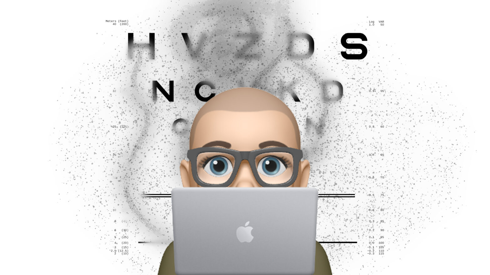
What do floaters look like?
I’ve updated my logMAR chart graphic to show their appearance (thin and blurry black threads) and what impact it has on reading text. Drag the red slider horizontally to see a before and after comparison.
Learning technologist side note
Creating a digital illustration of my floaters whilst being unable to see the screen clearly was incredibly hard. Before my sight loss, it might have taken me 10 minutes in Adobe Photoshop, today it took the best part of an hour. But hopefully this graphic does help with my storytelling.
Customising my tech
In an attempt to ride this episode out I’ve been making good use of accessibility features on all my key devices (phone, laptop and watch).
For example, on my iPhone running iOS 14.6 I have:
- Enabled ‘Bold Text’
- Enabled ‘Larger Text’ (increases text size options from 7 to 12)
- Increased the default ‘Text Size’ (8/12, default is 4/12)
- Chosen a darker ‘Appearance’ (i.e. dark mode)
- Enabled ‘Display Zoomed’ (increases size of icons and text boxes)
- Enabled ‘Increase Contrast’
- Enabled ‘Reduce White Point’ (30%)
- Enabled ‘Dark Appearance Dims Wallpaper’
Apps that support Dynamic Type will adjust to my preferred reading size. ‘LibreLink’ is one such app, meaning I can still easily view my blood glucose readings. Given that I use it 22 minutes every day for essential healthcare purposes it’s fantastic the developers have chosen to support this feature.
Another key feature is ‘Reduce White Point’ that is designed to reduce the intensity of bright colours. For me this helps minimise screen glare, a key problem caused by the standard silicone oil (SSO) in my right eye.
iPhone display comparison
This second interactive should help demonstrate how all these options combined have improved the overall level of readability for me. I’ve paired up before and after screen grabs of my favourite apps including Twitter and LibreLink.
How you can help
If you’re a developer, designer or someone who commissions websites think about requesting a design which accommodates both light and dark themes. Introduced in 2018, the CSS media query ‘prefers-color-scheme’ is pretty simple to add to any existing or new theme. It’s fully supported by every browser with the obvious exception of Internet Explorer.
CSS example
The following CSS excerpt from my own website shows how you can detect a user’s preference for dark mode – dimming the brightness of images and changing the body text to white on dark blue.
@media (prefers-color-scheme: dark) {
    .is-dark-theme.is-dark-theme img {
        filter: brightness(0.85) contrast(1.1);
    }
    .respect-color-scheme-preference.is-dark-theme body {
        background-color: #1F242F;
        color: white;
    }
}
Inclusive design
This simple example of inclusive design benefits a wide variety of use cases, for example: vision loss, migraines, night time, low light levels and a reduction in power consumption.
MDN Web Docs (Mozilla) ‘browser compatibility’ table
Wikipedia ‘Light-on-dark color scheme’
What happens next?
It’s just a waiting game now to find out if this bleeding stops and the floaters subside.
I’m definitely fatigued after four weeks of not being able to read clearly. But I’ve tried to explain my limitations to people around me and this transparency has definitely helped minimise my own anxiety levels.
Part of me has accepted the situation (it’s par for the course with my level of eye disease) and the other part is just fucking bored of having all these challenges (pardon my French).
Anyway, back to work and time to find my next distraction.
Copyright and licence
The text, images and interactives published within this post are all intended to be shared, reused and remixed. In order to encourage this I’ve applied a Creative Commons open licence to my own content where the only requirement is to include the following attribution.
Copyright © Stewart Lamb Cromar 2021 CC BY.
This work is licensed under a Creative Commons Attribution 4.0 International License.
Download, reusing and remix assets
Photographs and illustrations have been published to my personal Flickr account:
You can save any H5P object to your local machine with two simple steps:
- Click “Reuse” button
- Click “Download”
The file is now saved on your local machine. Please note you can’t open an H5P file on your machine, it has to be uploaded to a site supporting H5P.
Other credits
LogMAR chart
By user Fvasconcellos. Public domain, via Wikimedia Commons.